My branding and logo work is driven by purpose and clarity. I craft visual systems that are flexible across platforms, rooted in strong concepts, and designed to be instantly recognisable.
Whether it is a startup, a campaign or a rebrand, the focus is on aligning visuals with voice — from minimalist marks to detailed brand systems.
- Brand Identity01
- Logo Design02
- Visual System Architecture03
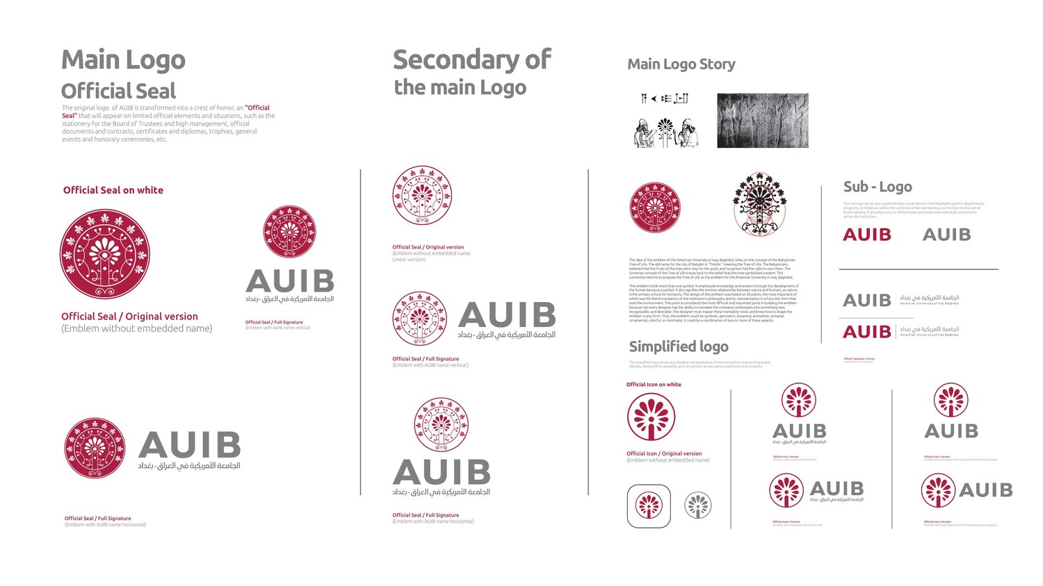
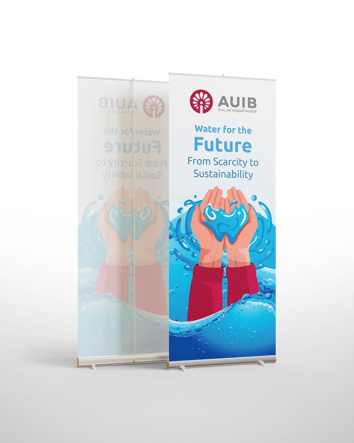
The AUIB emblem draws on the Babylonian Tree of Life — Babylon’s old name, Tintirki, means Tree of Life, and in Sumerian thought the tree symbolised wisdom. The mark connects knowledge, nature and human development.
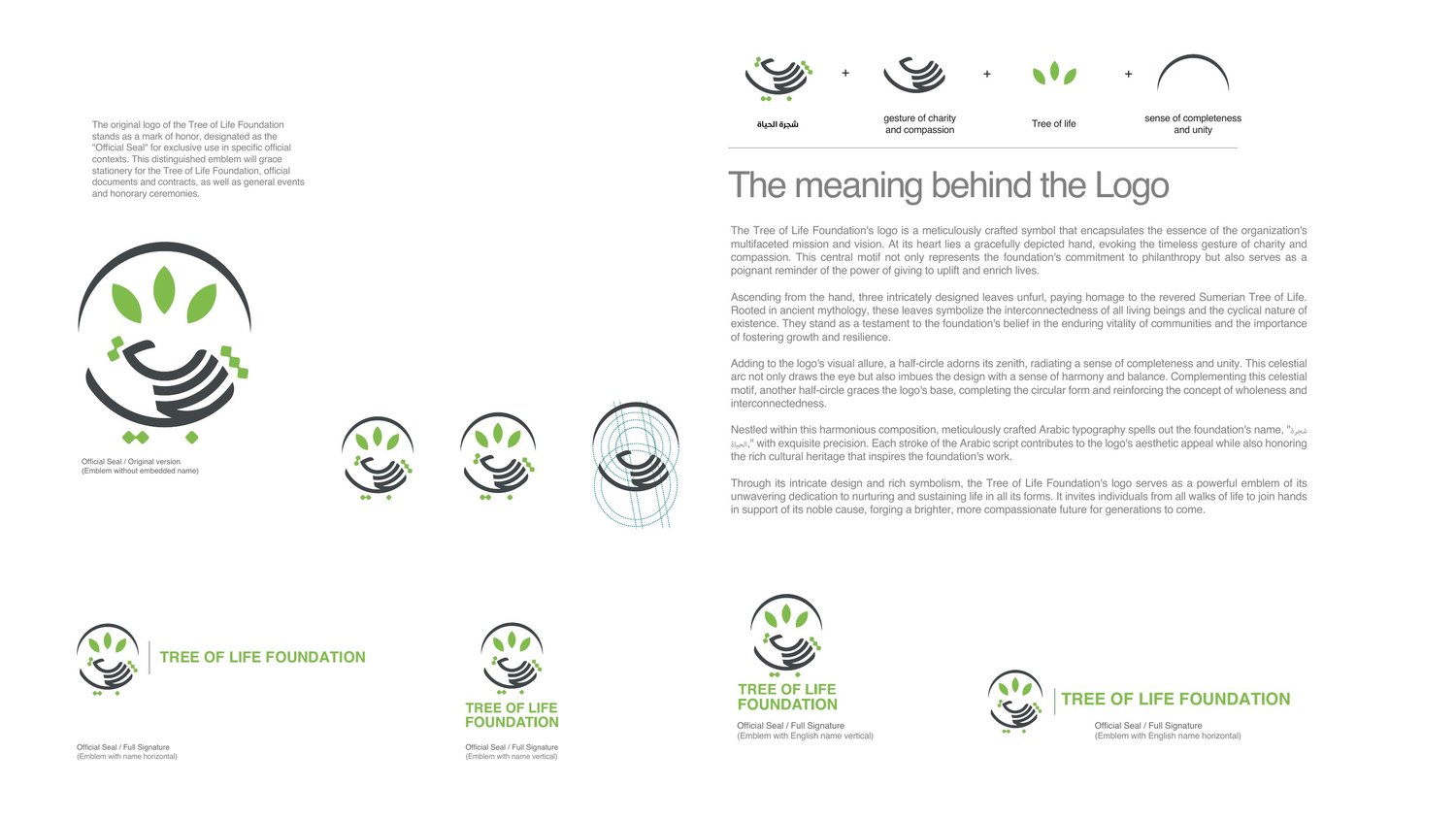
The Tree of Life Foundation seal centres on a hand — the gesture of charity and compassion — with three leaves rising from it and half-circles closing the form into a sense of completeness and unity, with Arabic typography set into the composition.
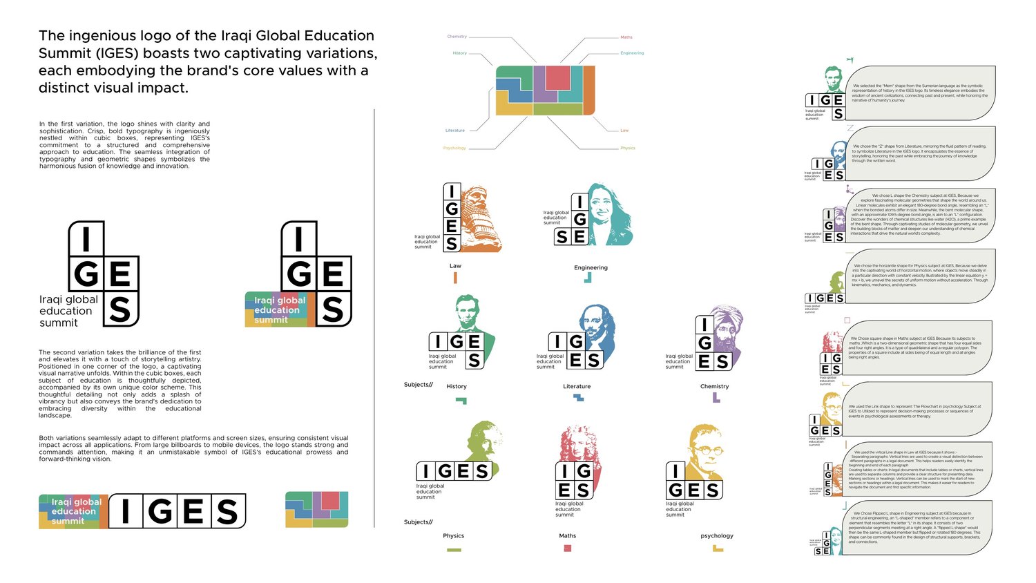
The IGES identity comes in two variations: bold typography nested in cubic boxes for a structured read, and a storytelling version where each subject is depicted in its own box and colour — history as a Sumerian "Mem" shape, literature as a reading-pattern "Z", chemistry as an angled "L" drawn from molecular geometry.
Concept
The mark has to translate the organisation’s philosophy, not decorate its name.
Construction
Geometry, spacing and Arabic/Latin pairing resolved so both scripts hold equal weight.
System
Seal, full signature, simplified logo, icon and sub-logo — one family, defined roles.
Scale test
From billboard to app icon: if it survives both ends, it ships.
- Discipline
- Brand & logo creation
- Selected
- AUIB, Tree of Life Foundation, IGES
- Output
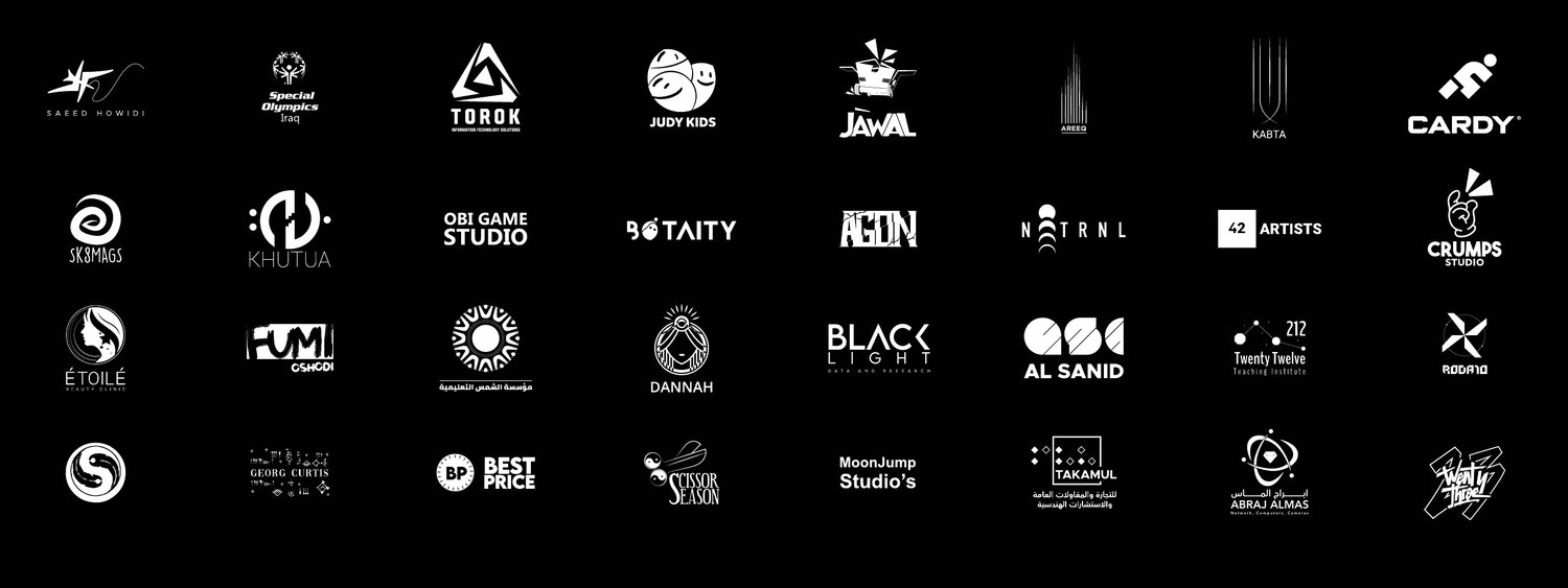
- Marks, seals, signatures, sub-logos, icon systems
- Principle
- Purpose, clarity, flexibility, recognisability